Transformed a fragmented ERP component library into a scalable, token-driven system—reducing duplication, introducing structured component logic, and aligning design with engineering.
Context
(The real problem behind the symptom)
This wasn’t just a messy Figma file—it was a system-level breakdown. The ERP product had scaled across multiple modules with different contributors, but without governance or structure.
By the time I joined the project, what teams called “inconsistent UI” was actually asystem architecture problem. The library had ballooned, naming was improvised, and instances were quietly detaching from their masters every sprint. Designers spent more time hunting components than designing screens. Engineers were quietly rebuilding the same buttons in three different files.
680–720
Components in Figma
~65
Truly unique components
92+
Button variations alone
5 - 6
Actual functional button types
Types of inconsistencies
- Same component recreated with minor visual differences
- Multiple naming conventions for identical elements
- Detached instances re-saved as new components
- States (hover, disabled, loading) built as separate components
For Designers
- — Unclear which component to use
- — Frequent overrides broke consistency
- — Slower handoff cycles
For Developers
- — No 1:1 mapping between design and code
- — Rebuilding similar components repeatedly
- — Inflated QA cycles
Approach & Ownership
The problem started as:
“Design feels inconsistent”
The library wasn’t organized by logic; it was organized by appearance. Three parallel systems coexisted — color-based, style-based, and state-based — each one expanding the surface area of the library without adding any new behavior.
I took ownership to transform this vague concern into a structured solution:
Audit & Quantify
Identify and measure duplication across the component library
Identify Structure
Define structural issues and what should exist vs be deprecated
Rebuild with Logic
Create a scalable system based on logic, not appearance
Key insight
- The introduction of multi-theme support revealed that the real problem wasn’t visual inconsistency — it was architectural dependency.
- The system was still organized around appearance-based values, which made themes reliant on duplicated components and manual overrides.
- This became the turning point from UI cleanup to system-driven design, where variables evolved from visual styling into semantic, scalable architecture.
The Shift
System Architecture
Core Design Principle
If structure and behavior remain the same, it should not be a new component.
I restructured the system into:
Structure
Components
Behavior
Variants
Styling
Tokens
Content
Slots
Before vs After
Before
- Color = Component
- State = Component
- Size = Component
- Icon = Component
After
- Color = token
- State = variant
- Size = variant
- Icon = slot
Early Challenges & Learnings
During the initial restructuring phase, variable declarations were organized primarily around direct visual values and isolated component usage. While this improved short-term organization, the approach became difficult to scale as the system expanded across reusable variants and theme requirements.
To solve this, the system evolved toward semantic variable architecture, where tokens represented purpose and behavior rather than raw visual appearance.
Token structure
Multi-Theme System
Approach
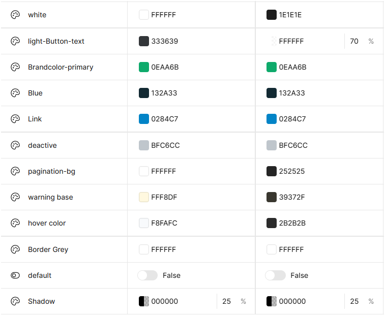
I separated: Primitive tokens (base values) and Semantic tokens (usage-based)
Primitive Tokens
brand-100 grey-500Semantic tokens
bg-button-primary text-primaryDeclaring Semantic tokens with primitive tokens to support multi-theme
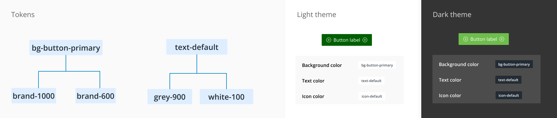
Why this matters
- No duplicate components for themes
- Easy updates without redesign
- Scalable theming across modules
- Aligns with engineering implementation
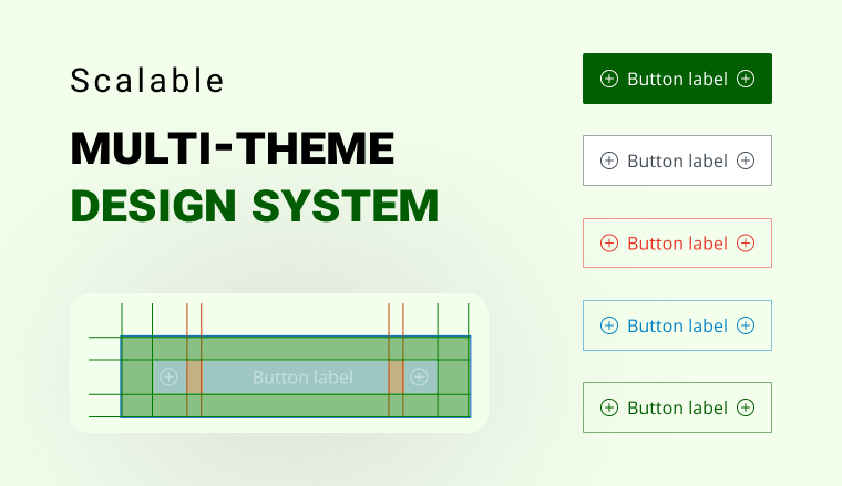
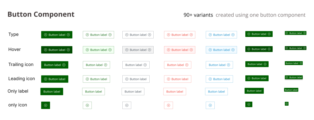
Component Deep Dive — Button
Quantifying what “inconsistent” actually meant.
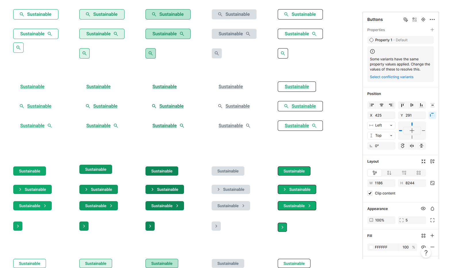
1 Base Component with controlled properties:
Type Primary secondary Ghost
Size sm md lg
State default hover disabled
Icon none left right both
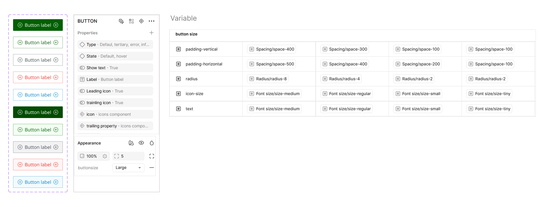
Key Decisions
Sizes
Fixed rules for spacing, typography, icon size. Removed manual resizing.
Variants
Based on purpose, not appearance. Destructive = intent, not new component.
States
Embedded inside component. Removed separate state components.
Slots
Leading icon, Label, Trailing icon.
Eliminated multiple button types into 1 unified component
Design ↔ Dev
The biggest unlock came from making the Figma model resemble the code model. Same vocabulary, same defaults, same mental model.
Before
No clear mapping between design and code
After
Code
<Button
  variant="primary"
  size="md"
  loading
  iconLeft
/>
Figma Properties
- variant: primary
- size: md
- loading: true
- iconLeft: true
Impact
Before
- — Fragmented system
- — Duplicate components
- — Dev inconsistencies
After
- — Single source of truth
- — Predictable usage
- — Faster design & development
60%
Component Reduction
Reduced from 180+ to ~55 components40%
Design Time
Faster component selection2x
Dev Handoff
Faster implementation cyclesOutcome
Scaling the system
The system was designed to scale through constraints, not extensions. New modules reuse existing components; new needs are absorbed by tokens, not new masters.
Flexibility vs. Consistency
I deliberately reduced visual freedom to prevent system fragmentation. Designers pushed back early — six weeks later they were faster.
Design vs. Engineering reality
The system mirrors how engineers actually compose components — props, slots, tokens — not how designers like to draw.
What could break
RISK 01 Detached instances drifting back into custom components
RISK 02 Discipline-dependent: structure alone won’t save a culture without reviews
RISK 03 Variant explosion if intent + state are added without governance
This wasn’t reducing components. It was a shift from appearance-based design to logic-based system design.
I focused on standardizing structure, behavior, and tokens — while leaving room for flexibility in layout, content, and edge cases. That balance is what makes a system usable at scale, and it’s the lens I now bring to every product surface I design.